The font we initially chose was 'Piece's Of Eight'. To develop this font to another level to make it unique, I edited the font in Macromedia Fireworks. I chose this program because I am capable of working effectively with the controls, because of previous use in the past. The effect I tried to reach was a gore/rough textured look. To get this I played around with the features of the program.

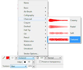
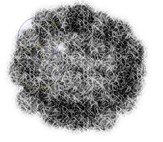
 The settings I chose to edit the text first was under the pain brush tool, where I played with the properties, where I could get really specific details. Above is an image of the specific settings. The Image below is the paint brush using black paint.
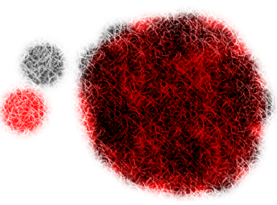
The image below is what I got when I placed the black over the red paint. This was the effect I wanted to apply to the Pieces of eight font. The colours together connotates death, pain and anger, which relates to the narrative of 'Sunday's Child' and the horror genre. The texture and style mixes the two colours in, and the red cracks into the black, giving a blood streaming effect.

Below are final images of the film title. Transparent and black background versions were created, this allows the team to engage the image in different background colours.


No comments:
Post a Comment