Wednesday, 27 October 2010

SUNDAY'S CHILD - FILM SYNOPSIS

Sundays Child

Waltonbury, a small and secluded rural village on the outskirts of Hertfordshire, has always been recognised for its close knit community where everybody knew everyone and secrets were unheard of.

That is until the first child went missing…

She’s young. She’s beautiful. Her corpse, laid bare in the bypass betrays no secrets, that is except for strange numbers seared onto the inside of her cold lifeless hand.

The first body was a warning.

When Molly, a teenage girl living in the village discovers that her sister goes missing, terror spreads through the isolated town. Molly begins to fear that a brutal serial killer is stalking the village streets; a shadowy madman without mercy or apparent motive. How could this be happening in a place so serene?

The final body…might be hers.

With the death toll rising, Molly races to expose a deadly conspiracy and the sadistic killer at its heart, and every move she makes could be her last.

Tuesday, 26 October 2010

Film Institution


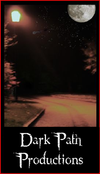
The image that we took ourselves was taken at nigh time. We timed this shot for the dark effect, as it ties in with the horror theme. It also ties in literally with the name; ‘Dark Path Productions’.
Our aim was to collect a few shots on the camera, preferably a long shot of a narrow road along with a street lamp.
With Lewis taking the shot on a high quality SLR camera and myself directing him we were able to collect the shot we aimed for.

In this image we can see:
  • 'Dark Path Productions' - font style=Northwood High
  • An over exaggerated moon,
  • A clear nights sky with shining stars,
  • An animated shooting star/ Flying comet,
  • A path/ road going into the darkness,
  • A shining street lamp revealing the path/ road curve into the distance, and
  • Trees on both sides of the road.


The moon has a good presence to the logo, as it is a very large object that obits earth, it has only been explored by few people and has much more to show then what we already know. The fact that it is a full moon adds superstition. All these facts alone denotes the personality of the Production Company; mysterious and superstitious, linking to the horror genre.

The clear night sky lets us view the over sized moon, as well the shooting star. The clear sky suggests a clear successful journey for the production company.


A shooting star is a special sight, as it is rare to see due to covering clouds and unpredictability. When a shooting star appears people praise it, like it is a pleasure to see. These facts all boost the reputation of the production company, as a special figure within the filming industry.


Below all the fantasy features is a path, lit up first by a street lamp, but then travels alone into the distance. This has a literal connection towards the name and a connection to the typical narrative structure of a horror. From the characters point of view the light symbolizes the equilibrium, but then after that comes the inevitable disruption. After the disruption comes the recognition, where another light source shines the path. After the recognition it is the protagonists responsibility to chose the right path to get to that final street lamp. The character may use sense and look up for answers, where the stars may direct the character to that happy ending. A risky decision that is rarely completed by the protagonist in horror movies.


The trees are either side along the path, which suggests that character that takes this journey can't be escaped from, as the arms of the trees are keeping the character within the path.

The dark scheme is an aspect of 'Pathetic Fallacy' where the human emotions are effected by the visual appearance of nature. The dark night adds superstition and cautions of what maybe ahead.

The name 'Dark Path Productions' is a recognisable name, as Alliteration is used.

Target Audience Profile

From my individual analysis of the group questionnaire conducted recently, I can now come to the conclusion of the films target audience. The film ideally needs a target audience of a certain size to make profit, as most films set out to do.
The first characteristic of the target audience is age; which in this scenario is between 15-25. The film may also appeal to others outside the age bracket as there is always that chance. This broad age group is categorized in my opinion as young adults, who go to the cinema for the social aspect, whether it be with school, college, university or work colleagues. The 'mode' age group we gave the questionnaires out to were 14-17. Using their views on the advertisement products we will know more what to incorporate into the finished products, and later evaluate why we did that. The choice's we decide will be chosen because they will either relate with the typical codes and conventions of the genre horror, ironical, link to a certain theme, and through the narrative.

The gender will be targeted at males and females. The responses we had from the questionnaire research shows that both genders are as interested as each other in horror films.
Social class is not a criteria to consider when discussing target audience, as everyone who has an income can afford to go to the cinema once a month or so, due to our statistics.
Other aspects of representation of characteristics that also are irrelevant are ethnicity and regional identity.

Wednesday, 20 October 2010

What I do when analysing an extract!!

CAMERA-


Camera shot is the amount of space that is seen in one shot or frame. Camera shots are used to demonstrate different aspects of a film's setting, characters and themes. As a result, camera shots are very important in shaping meaning in a film. Reviewing the examples on the right hand side of this page should make the different camera shots clearer.

Shot Types:
  • An extreme long shot contains a large amount of landscape. It is often used at the beginning of a scene or a film to establish general location (setting). This is also known as an establishing shot.
  • A long shot contains landscape but gives the viewer a more specific idea of setting. A long shot may show the viewers the building where the action will take place.
  • A full shot contains a complete view of the characters. From this shot, viewers can take in the costumes of characters and may also help to demonstrate the relationships between characters. For more information on costumes and acting refer to Chapter 4.
  • A mid contains the characters or a character from the waist up. From this shot, viewers can see the characters' faces more clearly as well as their interaction with other characters. This is also known as a social shot
  • A close-up contains just one character's face. This enables viewers to understand the actor's emotions and also allows them to feel empathy for the character. This is also known as a personal shot.
  • An extreme close-up contains one part of a character's face or other object. This technique is quite common in horror films, particularly the example above. This type of shot creates an intense mood and provides interaction between the audience and the viewer
Angles:
  • A bird's eye angle is an angle that looks directly down upon a scene. This angle is often used as an establishing angle, along with an extreme long shot, to establish setting.
  • A high angle is a camera angle that looks down upon a subject. A character shot with a high angle will look vulnerable or small. These angles are often used to demonstrate to the audience a perspective of a particular character. The example above demonstrates to us the perspective or point of view of a vampire. As a viewer we can understand that the vampire feels powerful.
  • An eye-level puts the audience on an equal footing with the character/s. This is the most commonly used angle in most films as it allows the viewers to feel comfortable with the characters.
  • A low angle is a camera angle that looks up at a character. This is the opposite of a high angle and makes a character look more powerful. This can make the audience feel vulnerable and small by looking up at the character. This can help the responder feel empathy if they are viewing the frame from another character's point of view.
Movements:
  • A crane is often used by composers of films to signify the end of a film or scene. The effect is achieved by the camera being put on a crane that can move upwards.
  • A tracking shot and a dolly shot have the same effect. A tracking shot moves on tracks and a dolly shot is mounted on a trolley to achieve the effect in the example above. This camera movement is used in a number of ways but is most commonly used to explore a room such as a restaurant. By using a tracking shot or a dolly shot the composer of a film gives the viewer a detailed tour of a situation. It can also be used to follow a character.
  • Panning is used to give the viewer a panoramic view of a set or setting. This can be used to establish a scene


EDITING-
  • A Straight cut break from one shot to the next. Cuts carry the
    continuity of action forward in a straightforward manner, from action to action or place to place.
  • Jump cuts are confusing cuts from one shot to the next that do not
    follow the obvious rules of cause and effect. These cuts are usually used to disrupt the
    audience’s attention in order to create shock.
  • Fade outs show the screen fade from an image to a black screen.
  • Fade ins show the screen fade from black to an image. Both fade-ups
    and fade-downs are used to suggest the passage of time and generally work to give
    the audience a chance to take a breath in preparation for the next scene.
  • Dissolves edits show one image slowly disappear as a new image is
    introduced. Dissolves are used to indicate the end of one event and the beginning of
    a new event or scene.
  • A Wipe edit is used to show one part of the screen literally wipe over the rest of the
    screen. One image disappears as it is replaced by a new image. This kind of edit
    is not often seen in movies, largely because it looks comic-bookish.
SOUND-


Diegetic Sound- Sound whose source is visible on the screen or whose source is implied to be present by the action of the film:
  • voices of characters
  • sounds made by objects in the story
  • music represented as coming from instruments in the story space ( = source music)
Diegetic sound is any sound presented as originated from source within the film's world


Diegetic sound can be either on screen or off screen depending on whatever its source is within the frame or outside the frame.


Non-Diegetic- Sound whose source is neither visible on the screen and has not been implied to be present in the action:
  • narrator's commentary
  • sound effects which is added for the dramatic effect
  • mood music
Non-diegetic sound is represented as coming from the a source outside story space.

MISE EN SCENE-

French for - PUT IN THE FRAME'
Lighting-

The intensity, direction, and quality of lighting have an effect on the way an image is perceived. Light and shade can emphasise texture, shape, distance, mood, time of day or night, season, glamour and it affects the way colors are rendered.

Types of lighting:
  • Low Key
  • High Key
  • Under lighting
  • Top lighting
  • Back lighting

Colour and Connotations-

  • Red - Energy, war, danger, strength, power, determination as well as passion, desire, and love.
  • Pink - Signifies romance, love, and friendship. It denotes feminine qualities and passiveness.
  • Brown - Suggests stability and denotes masculine qualities.
  • Orange - Combines the energy of red and the happiness of yellow. It is associated with joy, sunshine, and the tropics.
  • Gold - Evokes the feeling of prestige. The meaning of gold is illumination, wisdom, and wealth.
  • Yellow - Is the color of sunshine. It's associated with joy, happiness, intellect, and energy.
  • Green - Is the color of nature. It symbolizes growth, harmony, freshness, and fertility.
  • Blue - Is the color of the sky and sea. It is often associated with depth and stability. It symbolizes trust, loyalty, wisdom, confidence, intelligence, faith, truth, and heaven.
  • Purple - Combines the stability of blue and the energy of red. Purple is associated with royalty.
  • White - Is associated with light, goodness, innocence, purity, and virginity.
  • Black - Is associated with power, elegance, formality, death, evil, and mystery.


Props-
Objects make up the scene, and when creating a set the director must decide on the Props, as each prop can hold a connotation.


For example:

  • A gun- Suggests Violence, Anger and Pain.
  • A rose- Suggest Love, Passion and Romance.
  • A Football- Suggests Fair play, Respect and activeness.
  • A Baseball bat- Suggest Protection, Anger and Violence.
Hair and Make-up-
The style and Colour of hair builds a personality of a Character.

Men- Style:
  • Short= A clean, professional and well looked after person.
  • Long= Lazy and Doesn't pay attention to looks.

Woman- Style:


  • Short= Masculine and Modern.
  • Long= Traditional and feminine.
  • Straight= Pure and innocence.
  • Curly= Complicated and Busy.

Clothing-

This factor is important because it can build a strong suggestion of the character personality. Types of clothing can carry out different connotations. Sub-Cultures, Social class, Regional Identity, Ethnicity, Gender and Sexuality can create a characters representation, which can create an opinion for the audience, and can create an individual identity for each character.


  • Sub-Cultures- Chavs wear baggy and sporting clothes, Goths wear dark style clothing.
  • Social Class- Depends on the exspense of clothes. higher wear designer, middle wear casual clothes bought in regualar high street stores, and working wear second hand, damaged and old clothes.
  • Regonal Identity- People tend to wear clothes that are suitable for their living environment. People who live in the country and are into agreculture wear thick sway clothes, whereas in london and city's clothes can vary in style because there tends to be split of sub-cultures, and so clothes vary.
  • Ethnicity can be represented through traditional clothing that can be recognised easily, for example and Turban symbolises religion and a eastern descent.


Position within Frame

Selecting where to place the character is the directors job. Each character has a level of importance, and selecting where to put them in the cameras frame gives them a sense of identity, and makes things clear to the audience who are the main characters they are meant to focus on.

CLASSIFICATION

Film classification is a legislation that categorises films due to their content. The categories are age groups and limits under-age viewing because of potential emotional disturbances.

A film is judged upon a few issues, those being:
  • Language
  • Violence
  • Horror
  • Sex
  • Drugs
  • Nudity
  • Imitable technique
  • Tome
  • Discrimination/bigotry
  • Realism within fantasy
Universal
- It is impossible to predict what might upset any particular child. But a ‘U’ film should be suitable for audiences aged four years and over. ‘U’ films should be set within a positive moral framework and should offer reassuring counterbalances to any violence, threat or horror.

- If a work is particularly suitable for a pre-school child to view alone, this will be indicated in the Consumer Advice.

Parental Guidance
- General viewing, but some scenes may be unsuitable for young children.

-Unaccompanied children of any age may watch. A ‘PG’ film should not disturb a child aged around eight or older. However, parents are advised to consider whether the content may upset younger or more sensitive children.

12A and 12
- Exactly the same criteria are used to classify works at ‘12A’ and ‘12’. These categories are awarded where the material is suitable, in general, only for those aged 12 and over. Works classified at these categories may upset children under 12 or contain material which many parents will find unsuitable for them.

- The ‘12A’ category exists only for cinema films. No one younger than 12 may see a ‘12A’ film in a cinema unless accompanied by an adult, and films classified ‘12A’ are not recommended for a child below 12. An adult may take a younger child if, in their judgement, the film is suitable for that particular child. In such circumstances, responsibility for allowing a child under 12 to view lies with the accompanying adult.

- The ‘12’ category exists only for video works. No one younger than 12 may rent or buy a ‘12’ rated video work.

15
-No-one younger than 15 may see a ‘15’ film in a cinema. No-one younger than 15 may rent or buy a ‘15’ rated video work.

18
-No-one younger than 18 may see an ‘18’ film in a cinema. No-one younger than 18 may rent or buy an ‘18’ rated video work.

18R
-The ‘R18’ category is a special and legally restricted classification primarily for explicit works of consenting sex or strong fetish material involving adults. Films may only be shown to adults in specially licensed cinemas, and video works may be supplied to adults only in licensed sex shops. ‘R18’ videos may not be supplied by mail order.

Tuesday, 19 October 2010

STUDY OF NARRATIVE STRUCTURES

In our set Homework we were set the task to study the narrative structures of Horror Films. This would include writing about the narrative theory's conducted people in the past time, and analysing recent films and how they apply these concepts.


Toderov's Theory


Toderov's theory outlines 5 key stages to a basic storyline structure. Often renowned as the 'Classic' storyline as it's used in so many popular films.

1. Equilibrium introduced
2. Disruption of the Equilibrium
3. The Recognition of the Disruption
4. Attempt to repair Disruption
5. Reinstatement of the Equilibrium

http://www.writework.com/essay/media-writing-and-todorov-s-theory

Propp's Theory

This theory was developed by Vladmir Propp, based on the work of the Russian Formalists. Propp used Russian Folktales as the basis for his theory but it can be applied to all types of fiction as well as many movies.

7 Character types:


  1. The hero (seeks something)
  2. The villain (opposes the hero)
  3. The donor (helps the hero by providing a magic object)
  4. The dispatcher (sends the hero on his way)
  5. The false hero (falsely assuming the role of hero)
  6. The helper (gives support to the hero)
  7. The princess (the reward for the hero but also needs to be protected from the villain
  8. Her father
http://www.scribd.com/doc/8332774/Propps-theory-in-detail


To fully understand these theories I have analysed some thriller/horror films where I have outlined the Characters and their roles, along with a detailed analysis on the structure on the stories. Horror movies tend to not follow the Toderov's 5 stages chronologically because sometimes there is no happy endings. We can see from my analysis's that there are going to be more disruptions than anything else.

The Grudge

Disruption- The first scene we are shown is a couple in a multistory flat waking up in the morning. All of a sudden the man commits suicide by falling over the balcony to his death in the middle of the street.
Another scene draws us to a house where a young woman explores a house where she caring for a woman who has a disability. She hears noises. Seeking this noise she pops her head up through the attic door where she turns around until the haunting figure comes out of the darkness and kills her.

Equilibrium- Main Character Karen Davis (Sarah Michelle Gellar) is seen wake up in late in day. With her boyfriend they makes their way to work and splitting up during their journey in the busy city to each others jobs in the city.

Disruption- Karen goes to the house where the young girl disappeared and she covers her shift as she is missing, not knowing of the dangers. Karen explore the house until she is found by her boss in a tormented state.

Recognition - Karen is in hospital after a bad day at work. Questioned by the police they search for answers.

Disruption- Karen's boss and boyfriend are next to be perished by the haunting grudge.

Character role in The Grudge

  • KAREN - PROTAGONIST - VICTIM
  • DOUG - HELPER/DONOR - VICTIM
  • ALEX - KAREN'S BOSS - HELPER/ VICTIM
  • GRUDGE- VILLAIN
  • UNKNOWN SUICIDE MAN- VICTIM
  • YOKO - JAPANESE SOCIAL CARER- VICTIM

Saturday, 16 October 2010

Analysis of Questionnaire

We created a questionnaire as a group task to assess our target audience. The first part of the questionnaire will tell us more about the target audience, and so we can create a basic target audience profile. The second section tells us more about the target audience's preferences. Using the information gathered we can apply their wants into to finished product.


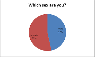
Q1.
We can see here we had more females answering our questionnaire than males. However 3% doesn't hinder the overall outcome by a large margin, so I think we can continue knowing that the answers my colleagues and I collected are valid and genuine. At the end of the day things could have ended up worse.


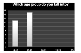
Q2.
The bar chart informs us that our target audience for the media products are aged 14-19. This was the best range we could manage and foreshore it would have been nicer to have a larger age group to market our products to. The questionnaires results will therefore cater for the ages of between 14 and 19 years of age. Using the information we have gathered as a team we can plan and apply their thoughts to our group task and subsidiaries.


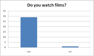
Q3.
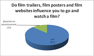
We needed to know whether our target audience watches films. A strong result informs us that the target audience is experienced in film watching and has the knowledge and understanding of what makes a good teaser trailer, poster and film website.


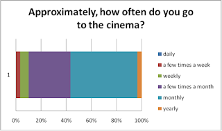
Q4.
These results lets me know that our target audience is a regular cinema viewer.
The most popular choice is monthly, this tells me that people go to the for the big blockbusters that have been highly anticipated by the use of marketing campaigns that include teaser trailers, posters and Internet advertisements to reach the target audience.


Q5.
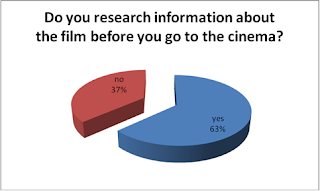
This directly informs us that the majority of the target audience researches a movie before paying to see it. A wise choice, but this also signifies that the target audience makes use of the products as part of the advertising campaign. So our products; both group and individual must appeal effectively to the target audience.


Q6.
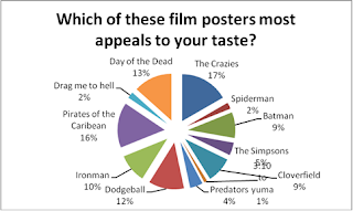
The Crazies, Day of the Dead and Pirates of the Caribbean are certainly the most aesthetically pleasing film posters to the target audience. Applying similar presentational devices will foreshore raise my chances of making a poster that appeals to the same target audience.


Q7.
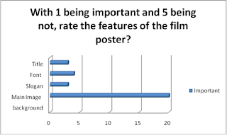
A huge portion of people voted that the main image should be the most important feature on the page. Due to the result I will manage my time effectively to produce an appealing main image, along with other features nonetheless.


Q8.
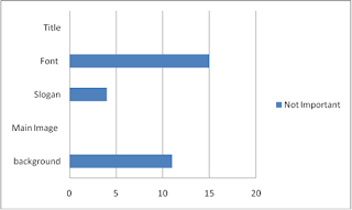
In this question we are trying to outline the unimportant features that appear on a film poster.
For the least important figure to appear on a film poster 2 features where opted as the least, those being the font and the background.


Q9.
In conjunction with question 5 we can say that the 3 forms of advertising I will be creating are vitally important to persuade the target audience to view it in the cinema. No one disagreed that they aren't important, and so it will influence the group and myself to create top-notch advertising products.


Q10.
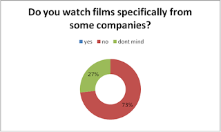
This question will tell me if the target audience judges the film depending on the institution behind it all. The results clearly shows in my favour, as the institution is not an important part in our production piece. However this isn't stopping me from designing our logo whilst considering the concepts adapted by the big institutes.


Q11.
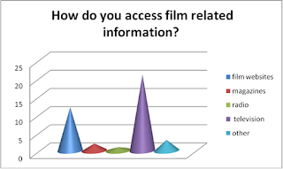
The question I am asking informs me how the target audience accesses the film related information. With no surprise the television is the powerful in response, whilst the website is the second most popular in response, as the internet is the fastest form of media to pass our generation. This answer also tells me that my website is just as important to complete as an advertisement product that appeals to the target audience.


Q12. Who is your favourite actor/actress?

Most popular answers:

· Christian Bale

· Will Smith

· Johnny Depp

· Leonardo Dicaprio

A high majority of these actors/actresses appear in horror films. Johnny Depp for example stars in Sweeny Todd, Sleepy Hollow etc... Studying the previous films staring these actors I could gain an understanding of what the target audience and figure out any devices used.


Q13.
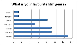
The questionnaire informs us that horror is by far is the most popular film genre. This reassures us that our chosen genre is popular and the target audience is of much relevance. Prior to this questionnaire the group members and my favourite film genre was horror, and we felt that we would be comfortable in producing an advertising campaign based upon the genre.


Q14. From your favourite genre, what would you want to feel from watching the film?

Most popular answers:

· Excitement

· suspense

· happy

· satisfied

· entranced

· Scared

· Emotional

· Laughter

· confused

· Fear

· Loved

· surprised

I mixed response I feel because its either a happy or a scared emotion they want to experience. both don't mix, and so I would have to make the decision that the target audience should fell scared whilst viewing our product, as thats what horror films do!


Q15.
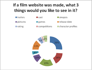
This question will give a good understand of what the website should include. Nevertheless, with a website it is virtually possible to include any of these features, but there are some features that are out of our reach due to the technical side; this statement referring to games.
The results stated that the target audience would want to see a trailer/ preview, cast list and synopsis.
I think they would prefer to see these features because they want to find lots of information about the film before attending the cinema, to determine whether it is worth seeing.


Q16.
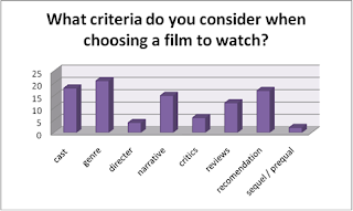
The results of this question not so clearly outlines that genre, cast, recommendations and narrative are the most important criteria for the target audience when choosing a film. The cast that we will be managing will be experienced in drama studies, and with our non-existent budget the actors/actresses will not be known. The narrative is down to our creativity as a group to make a successful storyline that interests the viewer.


Q17.
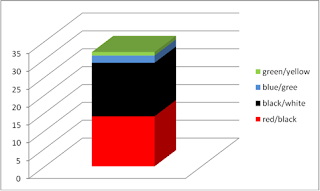
This Question asks what colour scheme they like the most. With red/black and black/white proving to be popular it fits in with the horror genre.


Questions 18-23 asks the target audience to clearly outline their opinion on what's important and what's not. With 1 being most important and 5 being least, the target audience gave their thoughts in numerical rating. The least important response we got was about the inclusion of the main character on the poster, whilst all other responses suggested that everything else was an important feature in work on.


Q18


Q19


Q20


Q21


Q22


Q23

Our Questionnaire...

This questionnaire is the final version created by our group. Through the research we are going to undertake we can give an overview of our target audience and what they want to see in a conclusion. This piece is of research is by far the most important as it is our only joint primary research method/technique used. It is our chance to find for ourselves what our target audience really wants, and so this questionnaire must be checked thoroughly and devised appropriately to ask those questions.


Monday, 11 October 2010

ANALYSIS OF WEBSITE: The Grudge 2 Official Website

The Grudge 2's Official Website is the one I have chosen to analyse, due to the Horror genre and the modern technology the media embraces.
Including the index/ directory page, the website as ten pages. During these chapters various types of medias are used to interact with the audience. Hyper-link(navigation button and textual link), text, image, video, animation and game formats are used within the website. Observing these features, I can tell whether they are feasible to include in my product. The games pages is beyond my capability, as i don't have the specific software available and the skills. Covering the other medias though shall be easier, as the teaser trailer could be feature in a WMV format, whilst there is a gallery page featuring images from filming and cast, a page for the synopsis in a text format, and in between these page are hyper-links to put them together.

The Horror genre is conveyed through the sinister colour scheme; black, red, white and brown. Along with the background settings, which are dark and mysterious. The home page features an external shot of the haunted house, then every other page is an interior, suggesting the house is a main influence in the storyline, in which is inevitably entered.

On most pages following the set house style, the title of the commodity is repeated. This continuity allows the audience to notice the products name, so they can address it easily when wanting to watch the final product.


Sunday, 10 October 2010

FILM POSTER ANALYSIS: Disturbia

'Disturbia' Film Poster.

The main Image is of three teenage characters, in a dark and hidden setting looking directly at the audience (direct mode of address), a common device used to entice the target audience. The black background connotes the horror film genre, as black brings danger and death into the frame.

At the centre of the image is the main character. We can only presume that he is the main character because his position within the frame (mise en scene), and he is the closest to the audience, suggesting we will see mostly him in the movie.

The two characters behind him suggests they are his backup, and they work as a team. The positions of the characters within the frame again suggest they are part of an alliance.

The protagonist we presume is taking the key role of holding the only prop, in the scopes of the telescopes we can see what exactly they are spying on. Litton up in a red frame, suggesting blood and danger, we can see two characters in a close by house in the local neighbourhood. In the left scope of the binoculars there is a mid-shot of a woman turned to her back, suggesting she is unaware of the spy's, revealing her character type as naive, a stereotypical statement for a woman. In the right scope is a close-up shot of a man, looking directly at the spy's, suggesting he is the villain and is aware of the spy's above.

The hands covering the binoculars shows that he has a firm grip on the left scope, by handling the scope all the way round, however in the right scope he only has grip on half the scope, suggesting the man inside is uncontrollable.

The facial expressions of the team in the dark setting indicates they are keeping a close eye on there enemy.

Disturbia- the font chosen to represent this title is almost like an old fashioned type writer, dating back to the World War 2, where type writers were the pinnacle of technology and written communication. The War theme suggests an aspect of the narrative, where there are two forces in battle; the people in the shadows and the people in the sights of the binocular. The white font colour connotes purity and innocence.

White font is once again used at the top of the page for a review from an external professional body (Alan Jones- Starburst). This persuades the reader that the review of 4 Stars is reliable and telling the truth.

Ever killer lives next door to someone. Text 61661 to find out if it's you! - This text is placed underneath the main image. Formatted in a different style with a red background and white font. With the use of presentational devices it isolates itself from other features on the poster. This piece of text acts as the films slogan, but has a unique effect. It makes people realise the possibilities of there being an actual killer nearby, and attracts money from people texting and enquiring about their nearby killer.

Friday, 8 October 2010

FILM POSTER ANALYSIS: The Last Exorcism


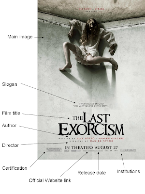
Main Image-
The main image that takes the entire page is lit up using high key lighting, and is of a girl/ young woman positioned at the top corner of a room. The girl hides her face with her long dark scuffled hair. Through mise en scene we can figure that she is working class, because of her selected costume, hair and makeup. The white colour scheme is not bright and pure, instead it has damp and dark patches, which relates to the narrative, where an innocent person is infected, and suggests something so pure and innocent can be corrupted into something it is not at first perceived to be.

Slogan-
"If you believe in god, you must believe in the devil."
This slogan is positioned in the middle of the frame, mainly to grab the attention of the audience. The slogan itself brings up a worrying subject; the Devil. A villain figure to all Christians, a supernatural entity that is the personification of evil and the enemy of God and humankind. Saying that you must believe in the devil brings controversy, as some people worship him. suggesting Christian believe in the devil is controversial, however suggesting Christians believe in the Devil's existent is understandable, as the devil otherwise known as Satan an appears in the bible as Jesus' enemy.

Film Title- 'The Last Exorcism'-
An exorcism is the procedure of extracting a demon/ dark religious entity from a human or object. The title is a slight give away of the plot, but very few people know the true definition.
Positioned in the middle of the page the title communicates directly to the target audience, along with the largest font size that appears on the poster. The fonts colour is black, which suggests evil, power and death. This use of colour portays the films genre as a Horror.

Author and Director-
Many people look out for the director's and other people who have an important part in the film. The target audience can judge a film from this, and relate the quality of the film from previous productions of the important people behind the creation. Directors such as Steven Spielberg, James Cameron, Tim Burton etc are well known for their outstanding contributions for composing films into a Blockbuster success.

Certification-
Placed in small size at the bottom left hand corner this is not a legal requirement to include in a teaser trailer, however showing its certification easily promotes the film to the correct target audience.

Official Website link-
This link allows the target to find more information on the official website, where information placed there is used to entice the target audience to a further level. With the Internet becoming a day to day application the target audience can have no trouble accessing this information.

Release Date-
In large capital font the Release date is published on the poster to inform the target audience when to view the film at the cinema. By publishing it here the poster would serve it's purpose; to present the product as an advert and inform when to view it. Capital font emphasizes the text and is known as a conventional presentation device.

Institutions-
The institutions behind the production take credit for the production, and act similar to the director names appearing on the front cover and poster. The production companies are recognised by many film viewers, and having one or more major production company produce a film is approved by some of the target audience, who judge a film from the institutions. On the poster we have the well known institution 'Lionsgate' and 'Studio Canal'.
Thursday, 7 October 2010

TEASER TRAILER ANALYSIS: The Dark Knight


The Dark Knight is the most recent of batman films. The Legendary batman movies have been going for years through many generations. Only recently batman started again in a new era of technology computer generated imagery that enhances effect and shows the creative ideas and action. ‘Batman Begins’ was released in 2005, directed by Christopher Nolan and staring Christian bale as Batman (Bruce Wayne) and his servant Alfred; played by British actor Michael Caine. Living in the modern day Batman fights crime but is considered an outlaw for taking justice into his own hands, howeverat the end of the does the right things. Batman has always been an action film genre, however has adopted the thriller genre because available technology and the connotations of a night animal sounds right to have it set at night. The thriller genre is why I am analysing this teaser trailer, as my groups teaser trailer is of a thriller/ horror genre.

The first thing we see is the slow coming logo of the Institution Warner Bros Pictures. This image has been manipulated from its normal gold cheerful colours to a silvery colour and a black background. This connotates the solid protection of the institution and suggests danger in the extract that the makers have created. The institution ‘Legendary Pictures’ adopts the same approach. Along with this is a high pitch disturbing sound that genteelly increases volume that bridges over the edits until the dialogue begins. This non-diegetic sound is very cold sounding and along with it comes a wind sounds. This gives us a sense of imagery where the main characters are, and then we are introduced to the dialogue, yet no picture.

The first voice is Bruce Wayne speaking; the audience knows this because of the previous film was played by the same actor. When he finishes his sentence on ‘fight’ a blue flash is shot from behind an object; that moulds into the black background. This object is unknown and is a mystery for the viewer. This mystery is a metaphor of the film as it sums up the film as a whole ever so slighly, and doing this gives an idea what the film is like. The flash is emphasized by a piece of non-diegetic sound, almost like thunder, creating that weather effect and a storm. A storm is a scary scene to be at, and so is perfect to imitate in a thriller genre film. Another shot is shortly fired. The fired gun effect connotes the crime part of the film. Another shot is fired but on the other side of the screen and misses the centralized unknown object camouflaged in the darkness, but only manages to shows the edge. Alfred (Bruce Wayne’s) the servant/ helper is the only other character to be heard. Played by Michael Caine his distinctive Cockney British accent is noticed worldwide, and has been in the filming industry longer than anyone can remember. This voice is highly recognisable and will be noticed by many film fanatics.

At the half way point of the minute extract more and more shots of blue lights are fired,turning the temperature on the heated atmosphere. Simultaneously shots are fired all around the mysterious figure until the point of when we know what the figure is. The mysterious object is the well known batman logo, and throughout the extract is a mystery in society. Further into the extract the source of energy gradually increases till the point where the figures wing’s deteriorates into pieces.

The batman image breaks up at the point where we hear a laughing sound. This laugh is the evil villain of this film, ‘The Joker’. The laugh breaks the batman into smithereens.

Wondering what’s going is the audience. But through what we’ve seen and heard the batman is coming to an end as he comes to his death, by the actions of the Joker. The batman breaks and the pieces fold into the direction of the camera, one piece folds showing a joker image and the joker text from the playing cards. The joker image shows a red a dressed joker and a tail like figure which he is holding. A bibliological link to the devil is introduced here and suggests this character has no soul and is the born enemy of all. This religious reference also suggests batman is the holy one, and is willing to die for others .This image shows the viewer a new thing to think of. Suggesting at first a game of cards and the whole storyline is a game where the batman must think on another level. The elimination of what the audience can only make out as the batman only brings questions; Is batman going to die and be defeated by the joker? They can only wait and find out, which is a great incentive to watch the full movie. The scene is then edited quickly. All sound is lost into a black image where the text ‘THE DARK KNIGHT’ fades in. The font being in grey/silver suggests tuff armour of a veteran fighter. Along with this is a faster ticking non-deigetic sound. Like a clock the sound is very fast and is ticking down to an important event. Soon after the text is replaced with ‘SUMMER 2008’ and below that are the institutions that had a part in producing the film. The ending then comes when everything fades out. The audience at this point is left in a cliff hanger scenario and is in the position of wanting to find out what happens in the film and if batman survives?

TEASER TRAILER ANALYSIS: Paranormal Activity

Paranormal Activity 2 is due to be released and the end of October 2010. Last year the first Paranormal Activity was released in America. Made on an extremely low budget of $15,000 the movie was produced independently by Oren Peli in his own home. Acquired later on by Paramount/ DreamWorks the horror movie was released worldwide. The film received a massive $193,311,485 in revenue, making it the most profitable film of all time.
First of all we are introduced to the certification of the film which is shown for a lengthy period, and advises people under the age of 17 to be accompanied by an adult. Real life footage shows people walking into the cinema and settling in with their attention to the main screen. At the bottom left text appears continuously to explain briefly to the viewer of the unexplained actions. The movie starts and we are introduced to the two main characters who discuss these freaky events that are happening to one of them at night. We are then moved on to the horror where unnatural and unexplainable events take event. The trailer at this point has frequent slides where there is just text, and then we are shown the movie action followed by the audience’s reaction. This editing pattern is continually going on, and speeds up to a much faster rate revealing more unnatural footage. This is then stopped at a sudden Holt signifying the end; the ending reveals the title ‘Paranormal Activity’ in the font style adopted by the film. The footage of the film is recorded mostly on video camera, and the hand held technique adds the effect that the drama actually happened, as photos in the movies fall off the walls. With edits non-diegetic generated sound effects are used for emphasis. The video camera microphone isn’t high tech and a great piece of technology to make a film with, however it grabs the attention of the audience as everything sounds so realistic.
The second word in the title (activity) jolts with lighting action and so does the edits during the ending. The edits are emphasized with heavy slams to add effect and to scare the audience at the intense moments.
Audience
The target audience for this teaser trailer I think would be aged 15 to 40 both male and female. The certification of the film is 15 so the film should automatically not be targeted to any below the age group. I would also say that the target audience would equal proportion of male to female. This film is shown to only people over the age of 15, as children may fear aspects of horror; jumping objects and edits, sound emphasis effects and unsuitable footage and language. By legislation standards it is enforced to age certificate the film and to make it clear at the start of the trailer/film, which on this exemplar does so.
Mise en scene
The teaser trailer includes elements that indicate the horror genre, these elements being part of mise en scene. First of which being the setting; a house is used as the main setting which follows stereotypical guidelines of a horror genre, as houses tend to be haunted. The caption is record at night, for the spooky ghost and spirit themed storyline. The lighting is low key to be specific.
Editing
Throughout the trailer straight cutting edits are mostly used, however emphasized by something else. This emphasis maybe made up from non-diegetic sound effects, that in effect boosts the horror in the frame. Another way to scare the audience is to speed the edits ups and change an edit at an unexpected time.

Tuesday, 5 October 2010

TEASER TRAILER ANALYSIS: Saw 3D


Saw 3D is the 7th and last installment to the saw movies and is created by the large mainstream institution lionsgate. With a large production budget of $17m it has used marketing products to entice the target audience, and make it a hugely anticipated film for its release date; October 29th 2010. To excite the anticipation they have produced a teaser trailer along with other marketing products to increase public relations.
The teaser I viewed was 27 seconds in length. The extract started off with a slow going certification that permitted people under the age of 17 to be accompanied by an adult. Next appeared the institutions that took part in the production, these being ‘Lionsgate’ and ‘Twisted Pictures’, they were introduced with quick speeding edits and parallel non-diegetic sound effects that emphasized the moving images, and to persuade the audience that the extract is based on the genre of horror. Straight after this is a quick flash of an image, this is of a TV with black and white pixels. This is included to suggest corruption, which could be the theme of the movie. This clip is extremely fast and would seem unnoticed to the average person. Not knowing what the image was exactly would start to get the audience wondering, and thinking for a period of time whilst they also focus their attention of the extract. This technique is also repeated a few seconds later. This time the image is introduced and executed in a flashing edit. The image is of a pig’s head which is pretty strange.

Used as a mask the pigs head has long drooping hair and looks as if it is attached to a body. Obviously this mask must be for the villain of the story. This also signifies the villain as a butcher, as he/ she cut up animals, and perhaps humans. This image alike the other comes and goes like a flash of lightning and so the audience must be very quick to realise.
Soon after the main characters are introduced, a female is shown in a dark place in a Close up camera shot technique as she is terrified and in pain, one second later we are shown a man this time chained by the wrists and in immense pain, as we are shown this from a Close up to a Mid shot using a jumping edit. This pain and screaming from the two characters shows the gore of the film and genre quite clearly.
Moving away from the dark indoor setting we are introduced to an exterior shot where the camera pans to feed images of the open city square to the audience. The camera moves almost like it is surveying the area, next a red and white circular target board is flashed for less than a second, which informs us that the public people we see in the city center are targets perhaps.
The narrator at this point is easily noticed to be the main villain behind the planned torture. As he says ‘all my work has been building up to this’- implying this last installment of the Saw series is going to be the best by far, which is a persuasive technique for the viewer to watch the film in the cinema. Next we are shown a different setting where a man is in a cage hanging over death spikes in a pit. This is shown to us through many shots; long, mid, over the head and below shot. At this point in the video the tempo rises gradually and this is shown through edits speeds and non-diegetic music. The extract throughout has adopted the method of formatting the video so it shows action, then text, action, then text etc... whilst the narrator/ villain is communicating directly to the target audience.
The end of the extract sees text appear gradually using a fade in edit. This text is the title, and beneath that says ‘the traps come alive’. This text uses play-on words, suggesting that the traps are actually alive and is personified by that word, or that the traps have someone that is alive inside. This device leaves the target audience wondering and wanting to view the movie.