 Q1.
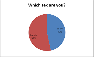
Q1.We can see here we had more females answering our questionnaire than males. However 3% doesn't hinder the overall outcome by a large margin, so I think we can continue knowing that the answers my colleagues and I collected are valid and genuine. At the end of the day things could have ended up worse.
Q2.
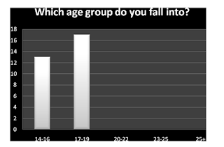
The bar chart informs us that our target audience for the media products are aged 14-19. This was the best range we could manage and foreshore it would have been nicer to have a larger age group to market our products to. The questionnaires results will therefore cater for the ages of between 14 and 19 years of age. Using the information we have gathered as a team we can plan and apply their thoughts to our group task and subsidiaries.
Q3.
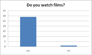
We needed to know whether our target audience watches films. A strong result informs us that the target audience is experienced in film watching and has the knowledge and understanding of what makes a good teaser trailer, poster and film website.
Q4.
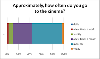
These results lets me know that our target audience is a regular cinema viewer.
The most popular choice is monthly, this tells me that people go to the for the big blockbusters that have been highly anticipated by the use of marketing campaigns that include teaser trailers, posters and Internet advertisements to reach the target audience.
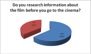
Q5.
This directly informs us that the majority of the target audience researches a movie before paying to see it. A wise choice, but this also signifies that the target audience makes use of the products as part of the advertising campaign. So our products; both group and individual must appeal effectively to the target audience.
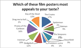
Q6.
The Crazies, Day of the Dead and Pirates of the Caribbean are certainly the most aesthetically pleasing film posters to the target audience. Applying similar presentational devices will foreshore raise my chances of making a poster that appeals to the same target audience.
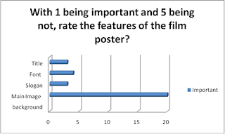
Q7.
A huge portion of people voted that the main image should be the most important feature on the page. Due to the result I will manage my time effectively to produce an appealing main image, along with other features nonetheless.
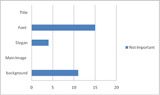
Q8.
In this question we are trying to outline the unimportant features that appear on a film poster.
For the least important figure to appear on a film poster 2 features where opted as the least, those being the font and the background.
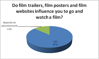
Q9.
In conjunction with question 5 we can say that the 3 forms of advertising I will be creating are vitally important to persuade the target audience to view it in the cinema. No one disagreed that they aren't important, and so it will influence the group and myself to create top-notch advertising products.
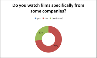
Q10.
This question will tell me if the target audience judges the film depending on the institution behind it all. The results clearly shows in my favour, as the institution is not an important part in our production piece. However this isn't stopping me from designing our logo whilst considering the concepts adapted by the big institutes.
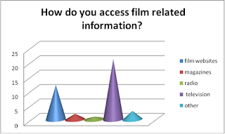
Q11.
The question I am asking informs me how the target audience accesses the film related information. With no surprise the television is the powerful in response, whilst the website is the second most popular in response, as the internet is the fastest form of media to pass our generation. This answer also tells me that my website is just as important to complete as an advertisement product that appeals to the target audience.
Q12. Who is your favourite actor/actress?
Most popular answers:
· Christian Bale
· Will Smith
· Johnny Depp
· Leonardo Dicaprio
A high majority of these actors/actresses appear in horror films. Johnny Depp for example stars in Sweeny Todd, Sleepy Hollow etc... Studying the previous films staring these actors I could gain an understanding of what the target audience and figure out any devices used.
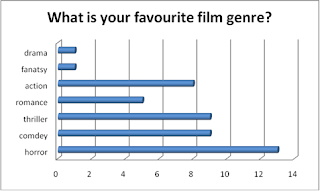
Q13.
The questionnaire informs us that horror is by far is the most popular film genre. This reassures us that our chosen genre is popular and the target audience is of much relevance. Prior to this questionnaire the group members and my favourite film genre was horror, and we felt that we would be comfortable in producing an advertising campaign based upon the genre.
Q14. From your favourite genre, what would you want to feel from watching the film?
Most popular answers:
· Excitement
· suspense
· happy
· satisfied
· entranced
· Scared
· Emotional
· Laughter
· confused
· Fear
· Loved
· surprised
I mixed response I feel because its either a happy or a scared emotion they want to experience. both don't mix, and so I would have to make the decision that the target audience should fell scared whilst viewing our product, as thats what horror films do!
Q15.
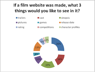
This question will give a good understand of what the website should include. Nevertheless, with a website it is virtually possible to include any of these features, but there are some features that are out of our reach due to the technical side; this statement referring to games.
The results stated that the target audience would want to see a trailer/ preview, cast list and synopsis.
I think they would prefer to see these features because they want to find lots of information about the film before attending the cinema, to determine whether it is worth seeing.
Q16.
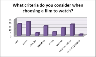
The results of this question not so clearly outlines that genre, cast, recommendations and narrative are the most important criteria for the target audience when choosing a film. The cast that we will be managing will be experienced in drama studies, and with our non-existent budget the actors/actresses will not be known. The narrative is down to our creativity as a group to make a successful storyline that interests the viewer.
Q17.
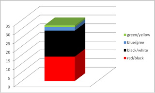
This Question asks what colour scheme they like the most. With red/black and black/white proving to be popular it fits in with the horror genre.
Questions 18-23 asks the target audience to clearly outline their opinion on what's important and what's not. With 1 being most important and 5 being least, the target audience gave their thoughts in numerical rating. The least important response we got was about the inclusion of the main character on the poster, whilst all other responses suggested that everything else was an important feature in work on.


No comments:
Post a Comment